Let’s talk about fonts because HOW you say something is nearly as important as WHAT you are saying. Rhetoric – speaking and writing in a persuasive manner – goes far beyond simple word choice. Our choice of fonts in the branding of our message offers subtle clues to observers of how we think of ourselves, the kind of image we are want to portray, and the audience we hope to connect with. When we read a text, we are reading it in the tone the speaker wrote as much as the tone it is packaged in.
When choosing a font, some ideas to consider:
- What am I trying to say?
- What is the emotion I want to convey?
- Who is my target audience?
We’ll talk about a few different and important aspects of fonts. I think anyone who steps foot into the self-directed world of the self-employed should have at least a basic understanding of the psychological impact fonts have on their audience. That understanding gives us a greater ability to convey the message we have to share with the world.
Thin vs. Thick Fonts
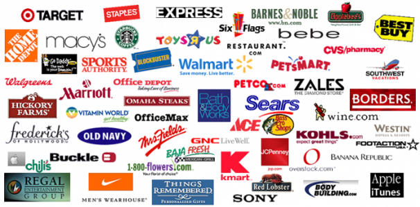
You’re driving down the highway and you pass one of those strip malls that has everything from Party Central to Michael’s to Best Buy to Nordstroms and so on. We’ve all seen those tall signs with their lists of stores. Best Buy is in thick letters. Michael’s is an italic serif font. Party Central is jaunty and thick. Nordsrom’s is rather thin.
The tl;dr is this: thick fonts are used when deals are being offered. Thin fonts are for the finer fare.
The thick fonts are selling themselves to a segment of the population that wants more for less. Best Buy, Big Lots, KMart, Target – these are all thick fonted brands offering the best value for the dollar. Even Dell vs. Apple: Dell is a thick font while Apple is a thin font. Apple is considered the ‘finer’ product while Dell is considered an entry level computer brand. On the other hand, Nordstrom’s, Macy’s, JC Penney, and many more are seen as offering a finer product and the thin lines of their branding intends to convey that. To the masses, the thin-fonted brands are generally considered sleek and refined.
So: thick fonts connote a sensation in the mind of being a good deal though possibly lower quality and thin fonts are considered more refined and of higher quality.
Serif vs. Sans-serif
For those that don’t know, the serif is the little curly cue at the end of a letter: Times, Garamond, Baskerville – these are serif faces. Optima, Helvetica, Arial are your sans-serif fonts.
The sans-serif conveys a sense of modernity. Most tech companies – Android, Apple, Samsung, Microsoft – all of them use sans-serif fonts. They are seen as efficient, easy to access, easy to read, very straight forward and user-friendly. Even though Sony uses a serif style font, it’s still as refined as possible. Sans-serif fonts are great for smaller text on a flyer or blocks of text on a website as it’s easy for the eyes to parse the information that is being presented.
Serif fonts on the other hand feel ‘classic’. They are the fonts of literature and learnedness. Serif fonts are great for books and titles. Serif typefaces have been shown in research to engender a feeling of greater trust in the reader. They feel comforting and relaxed – the serif font is something that has been used on some of the most revered books, titles, and texts since the dawn of the printing press.
If you are printing a book, say, then this it is most often better to choose a more ‘classic’ font. There’s a reason people stick to the classics. Garamond (my personal favorite) has been in use since Claude Garamond developed it in the 1500s. Baskerville was designed in 1757. There’s new serif fonts that arrive now and again, but many of those are based on older designs. For instance, there’s Garamond, Garamond Pro, and Adobe Garamond – all versions of Garamond but redesigned and refined for modern use and tastes.
If the serif fonts that we love arrived with the introduction of the printing press, then the sans-serif fonts primarily showed up in our vernacular with the advent of our modern technological world. Helvetica – the most over-used font of all sans-serif fonts – was developed in 1957. It rode in on the crest of the nuclear age and our retro-future 1950s. By the same token, Optima – my personal favorite for all my personal stuff – was designed in the mid-50s as well. There’s countless others that have been designed for our modern use – for screens and interfaces, street and subway signs, and so on. Apple recently released a new font they fittingly call San Francisco that is the de facto font for their Yosemite operating system. It is designed to be shrunken down to a very small point size without losing legibility, something that serif fonts don’t do very well.
Decorative Fonts
Decorative fonts are tricky. Here’s the thing: the decorative font you choose will probably be out of style in a few years. How often have you seen a typeface that instantly conjures up a specific decade? That 70s font. Or that 80s font. That raver font. And so on. The best thing to keep in mind is that decorative fonts become dated easily and, as such, they are usually best suited for posters, flyers, etc – anything that has a specific one-time use. Decorative fonts are passing so use them for things which also are passing.
One More Bit

I talked a lot about stores and mass-market consumer brands. But then, what if you DON’T want to hit the mass market? What if your market segment is, say, the London Punk scene or New Jersey rockers or people who will sew your patch to the back of their denim jacket? I think this image sums up that entire discussion. The Beastie Boys? Street punks who don’t take themselves very seriously – hence the lower cased letters. AC/DC? KISS? Thick easy to read font for the working man – if the working man likes electricity. Sex Pistols? If you’re into dangerous ransom notes, then you’ll be into them. Bruce Springsteen? He’s a no nonsense kind of guy and, I guess, that’s what he’s trying to say with that boring no-nonsense font? I think that bands in particular get to flaunt font choices. Afterall – if the music screams, then why shouldn’t the logo? Or, as in the case of Led Zeppelin: their music is an amalgamation of all sorts – metal and sitars and pretty songs and crazy songs – so their font is both reminiscent of Charles Mackintosh and art deco and sharper more electric lines.
Bands are artists and they’d want the rhetoric of their fonts to SAY something – it sings along with the music, just as your own text should sing along to whatever your own art happens to be.
How We Say What We’re Saying
So maybe you want to be quirky or zany – there’s a font for that! It’s not Baskerville. Maybe you want to be seen as austere and refined. There’s a font for that too. You can’t use Fiesta and then expect to be taken very seriously. Our minds have been wired through constant visual conditioning to experience the world in a certain way. Sure, you could try to upset the status quo and write something incredibly serious comic sans, but, unless you’re goal is to sow confusion and not actually be taken seriously, you won’t be communicating your message clearly.
Personally, I figure there are places where I can push the boundaries – as in my art – and then there are places – like in the title branding of my website – where I’d rather play into the norm because it is inviting and feels safe for people who might otherwise not stick around. On the other hand, if you go look at the Misfits logo… well, they WANT you to feel uncomfortable. They would rather turn away people who won’t like their logo. That works for them. There’s an audience for everyone and there’s a way to reach that audience. It starts with what we say and then how we package it.
The next time you’re out in the world: take a look around. There’s a whole lot of people in our consumer culture trying to get our attention – from billboards to bus stop benches to packaging to web banners and so on. All of them are trying to present information in such a way to draw us in – to trigger an emotional response, to buy our trust, to earn a living. Think about the fonts that are being used and how they make you feel. Then think about what YOU yourself are trying to say and how you fit into that dialogue – and how you stand out. The truth is: when we go into business, we ARE a part of that dialogue, whether we want to be or not. So making clear and intentional choices of how we want to engage in that dance is imperative to creating a solid business container for ourselves.
I hope you enjoyed that little font-diatribe. We’ll talk more in the future about the rhetoric of our design choices and how it frames our respective art.
Cheers!